Case study — intern verification platform

A Quiet Standard, Made Visible

How promptintern.co.in turns an assessment into a badge a team can hire on — one dark canvas, one loud accent, evidence in every section.

My role
Designer & Developer
Scope
UI/UX Design, Website Development
Client
PromptIntern — intern verification
Live site
promptintern.co.in
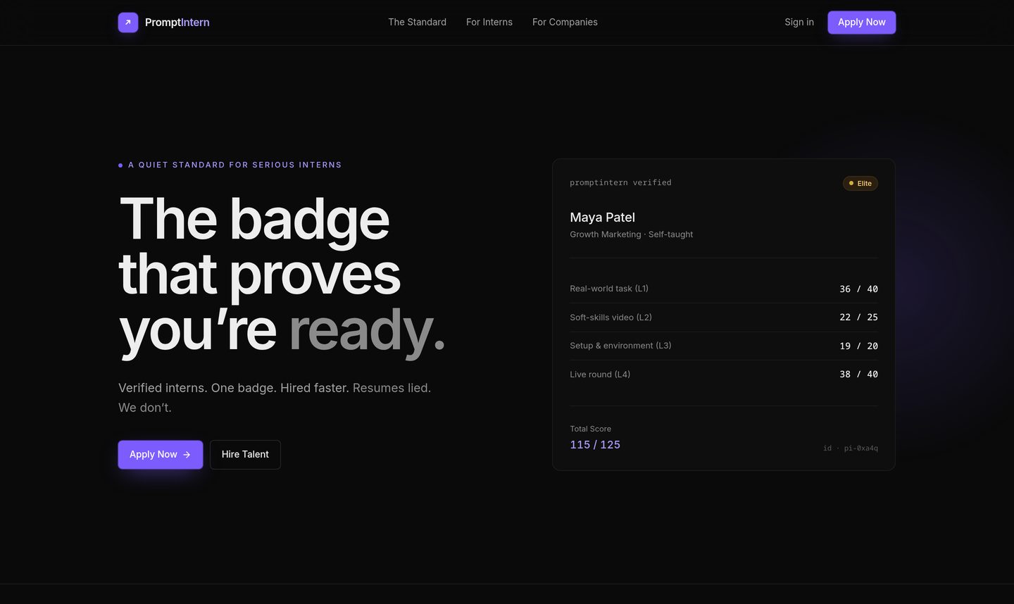
PromptIntern homepage hero section

The challenge

A credential has to be believed before it is useful.

The platform asks two things of two people: an intern to be assessed, and a company to trust the assessment. Neither will move first. So the page cannot open with a feature list — it has to put the proof on screen in the first second, then keep stacking it until the close.

The approach

Show the badge. Don't describe it.

The hero carries a real dossier: four layers, four scores, a total out of 125 and an id. Everything below repeats that move — a claim on one side, the object that proves it on the other — so the reader never has to take the copy's word for anything.

Colour does the rest. On a near-black canvas, indigo is saved for actions and amber for the Elite tier, so the two things that matter — what to do next, and how rare this person is — are the only things that stand out.

Design breakdown

Seven decisions that carry the page

Every numbered marker sits on the part of the live website it describes.

PromptIntern hero: headline on the left, verified scorecard on the right
01

Hero & the badge

The headline makes the promise, the card next to it makes it checkable — four scored layers and a total out of 125, with an id. A badge is shown as a document, so the claim arrives already evidenced.

  • Visual hierarchy
  • Proof over claims
  • Contrast
Three tier cards: Rising, Verified and Elite
02

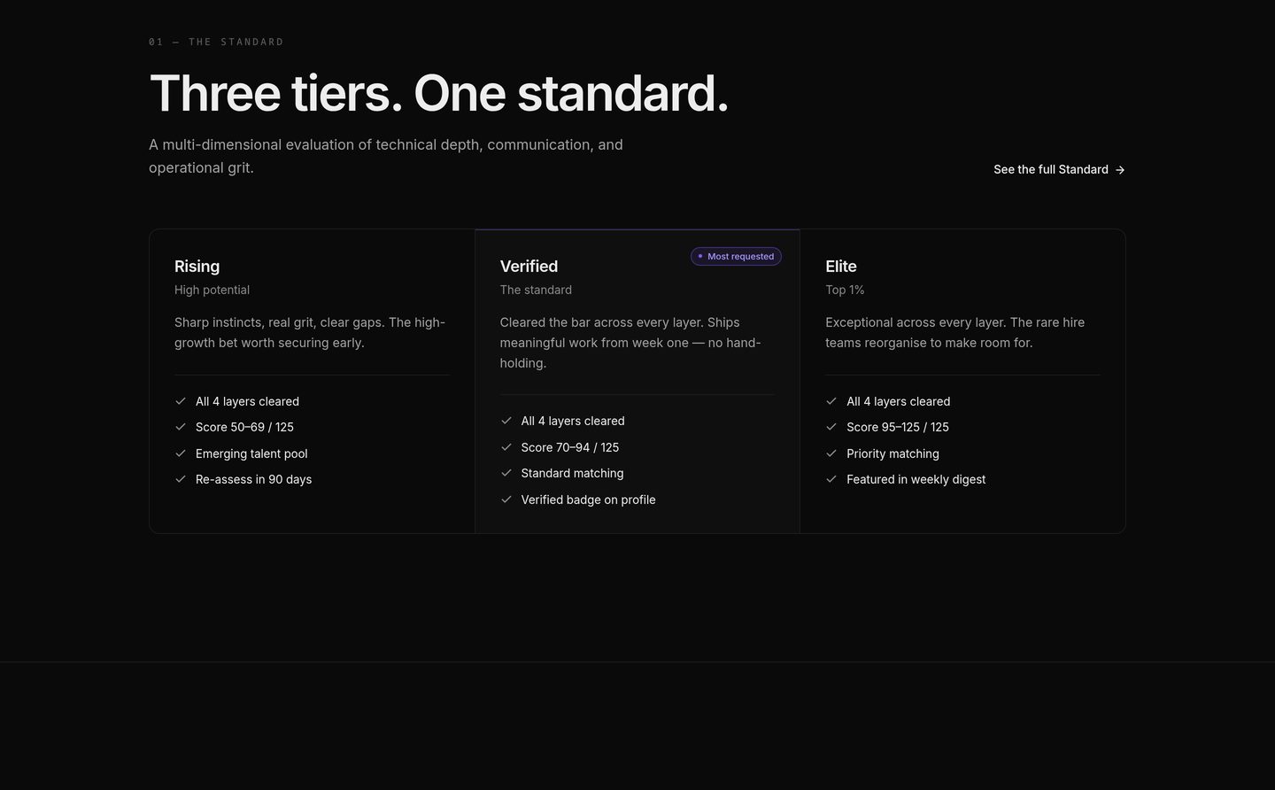
Three tiers, one standard

Rising, Verified and Elite run side by side on the same four-line checklist, so the difference between them is a score band rather than a paragraph. The middle card carries the only badge in the row.

  • Content grouping
  • Comparison
  • Emphasis
Four assessment layers listed beside a candidate dossier
03

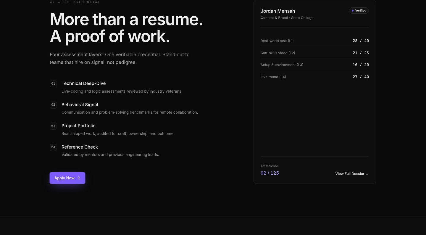
The credential, layer by layer

A numbered list explains what is assessed; the dossier beside it shows the same four layers filled in for a real person. Explanation and example sit at the same height, so neither has to wait for the other.

  • Two-column balance
  • Numbering
  • Consistency
Four year-one targets in a single row
04

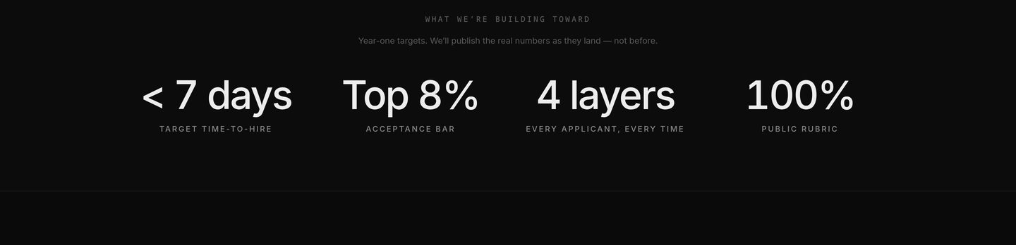
Targets stated as targets

Four numbers, one line, and a sentence that says the real figures will be published when they land. Holding a target as a target keeps the row credible — the page never dresses an intention up as a result.

  • Restraint
  • Big type
  • Honest framing
Three testimonial cards from interns
05

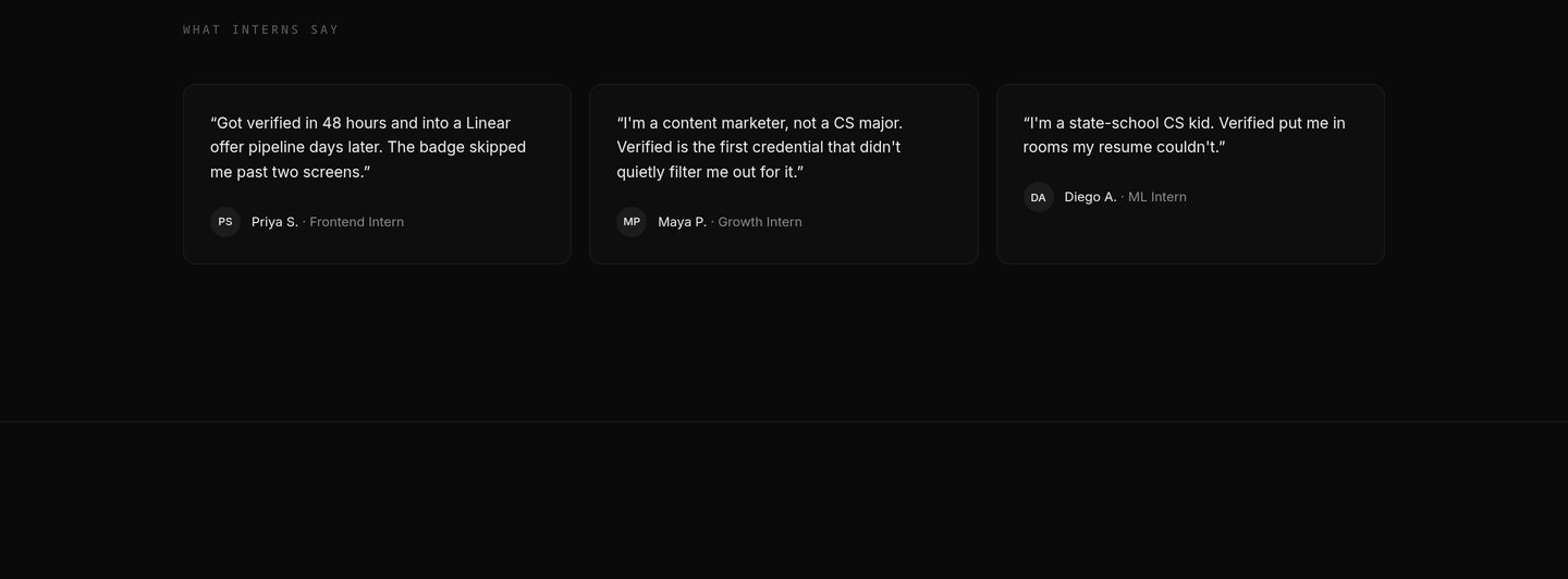
Intern voices, unabridged

Three quotes, each with initials, name and role, sized to be read in full. Nothing is clipped into a slider — the feedback is long enough to be believed, so it is given the room.

  • Social proof
  • Readability
  • Whitespace
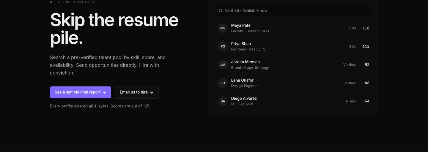
Searchable table of verified candidates beside the company pitch
06

The hiring side

The same page serves two audiences, so the company pitch gets its own object: a searchable talent table with tiers and scores already in it. The product is the argument here, not a description of it.

  • Audience split
  • Data presentation
  • Interface as proof
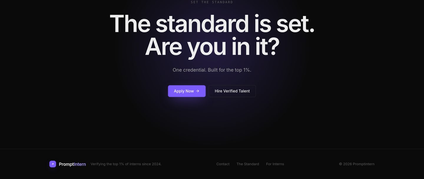
Final call to action above the site footer
07

The close

One label, one line, two buttons — apply or hire. A violet glow sits behind the block so the last screen feels like an ending, and the footer stays quiet beneath it.

  • Single focus
  • Glow
  • Clear CTA

Design system

A dark canvas with two loud notes

#08080A

Near black

The whole page sits on one continuous dark canvas — no section flips, no white breaks.

#0D0D12

Card surface

Anything that is evidence gets a card: the scorecard, the tiers, the talent table.

#635BFF

Indigo

The only loud colour. Primary actions, scores and the glow behind the close.

#FBBF24

Amber

Saved for the Elite tier — the rarest signal gets the rarest colour.

Typography

One grotesk across the whole page. Hierarchy comes from weight, size and letter-spacing rather than a second typeface — and the numbers are always the loudest thing in the room.

Spacing

Sections breathe on a single continuous canvas. Nothing needs a border to be understood; the card surfaces do the separating instead.

Composition

Two columns where there is an argument and a proof, three where there are tiers, four where there are targets — the grid count follows the amount of evidence on screen.

My process

Five moves, one owner

Structure, design and build stayed with me, so the page never had to translate itself between hands.

  1. 01

    Frame

    Held the two audiences apart: an intern who wants to be believed, a company that wants to skip the resume pile.

  2. 02

    Structure

    Ordered the page as a proof ladder — promise, tiers, layers, targets, voices, hiring, close.

  3. 03

    Design

    One dark canvas, one loud accent, one card language for anything that counts as evidence.

  4. 04

    Develop

    Built it as a single scroll with real objects: a scorecard, three tier cards, a searchable talent table.

  5. 05

    Refine

    Tuned type sizes, glow and spacing until the hierarchy read at a glance, not on a second pass.

Final outcome

A credential you can see being earned.

Final homepage close and footer

Final close & footer

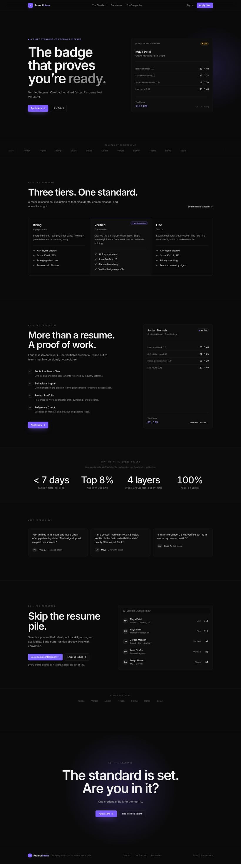
Full page preview

Full page preview of the promptintern.co.in homepage

Scroll to review every section

  • One dark visual language across every section.
  • The credential shown as a real scorecard, not a promise.
  • Three tiers that can be compared in a single glance.
  • Two audiences — intern and company — served on one page.
Visit the live website

The page as shipped — promptintern.co.in