Hero Section
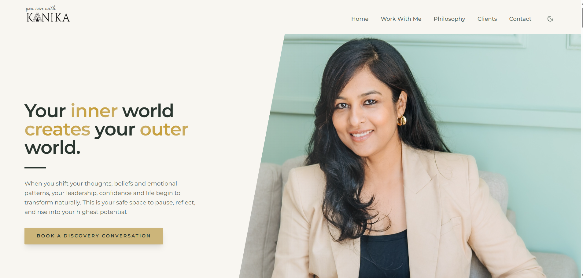
A bold headline with the key words picked out in gold, a portrait held in a diagonal mask, and one clear booking action. The eye lands on the promise first, the person second, the button third.
- Visual hierarchy
- Contrast
- Whitespace

Case study — leadership coaching website
How I transformed a challenging client pitch into a complete leadership coaching website.

The challenge
The client showed our team her existing website and explained the kind of impression she wanted her personal brand to create. The site did not yet communicate the brand experience she was describing — and we were running out of opportunities to secure the client.
The turning point
During the meeting I took a different approach. Instead of simply discussing ideas, I developed a new design direction that demonstrated how her website could better communicate her personality, expertise and leadership philosophy.
That design direction helped us secure the contract. I then independently designed and developed the entire website — working closely with the client through continuous feedback, reviewing design decisions, and refining the visual hierarchy until the final website reflected the impression she wanted to create.
Design breakdown
Every numbered marker sits on the part of the live website it describes.

A bold headline with the key words picked out in gold, a portrait held in a diagonal mask, and one clear booking action. The eye lands on the promise first, the person second, the button third.

A deep forest green strip carries four credentials side by side — ICF accreditation, Gallup certification, coaching hours and global client experience. Proof sits directly under the promise, before any service is explained.

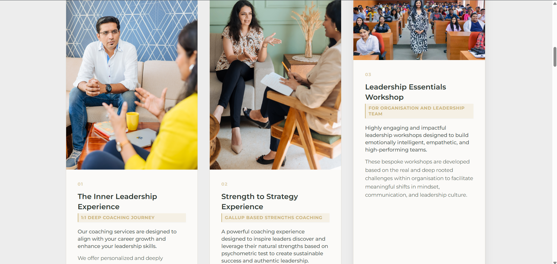
Three image-led cards, numbered 01 to 03, each with a badge label, a short description and a details list. Same structure on every card makes three different engagements easy to compare.


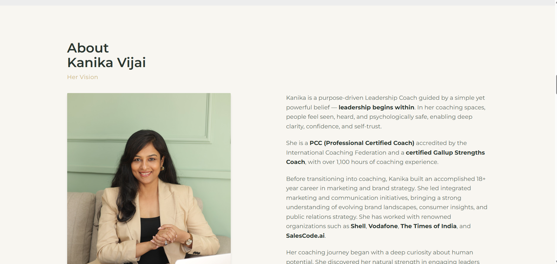
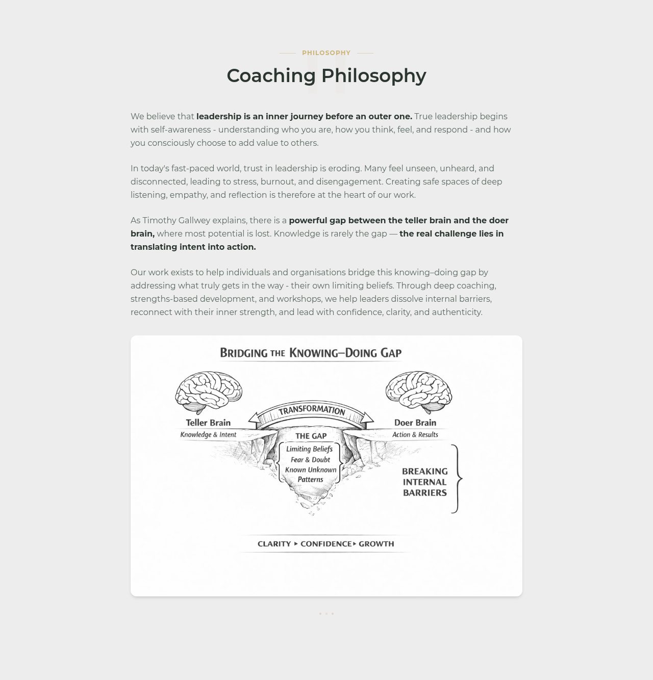
Portrait and biography balance each other in two columns, so the story reads as calmly as it is told. The philosophy section below turns an abstract belief into one diagram — the knowing–doing gap — instead of another paragraph.

Fifteen organisation logos in two even rows on white. Nothing decorative — the grid is quiet so the names do the talking.

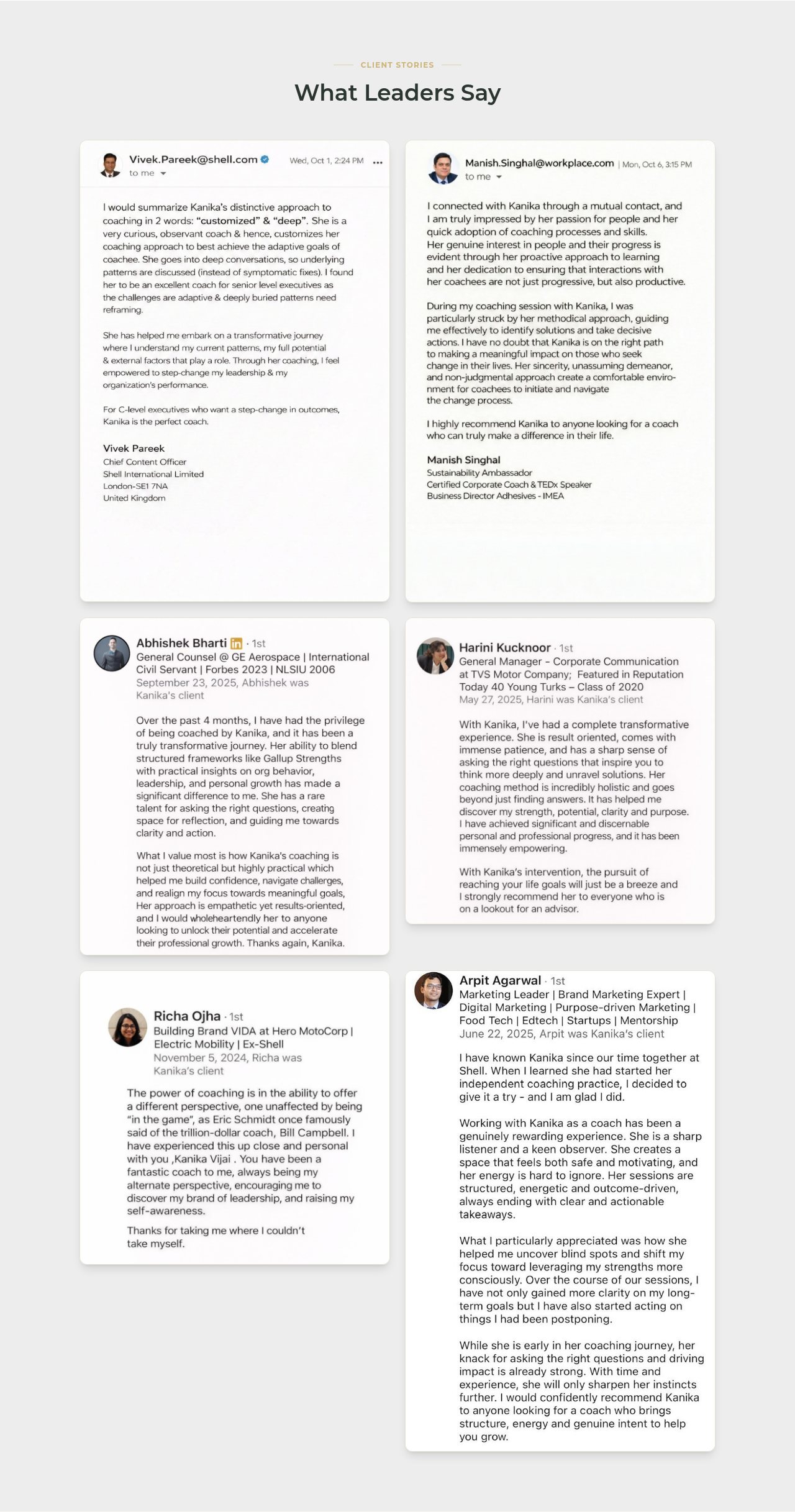
Six large cards — two email notes and four LinkedIn recommendations — each showing the person, their role and their organisation. Long feedback stays readable instead of being clipped into a slider.
Design system
#22392D
Forest green
Depth and authority — used for the credentials strip and the turning-point panel.
#F8F6F1
Cream
Openness and readability — the page background every section sits on.
#CDB57A
Muted gold
Emphasis and important actions — highlighted words, labels and the booking button.
#EDEDED
Neutral grey
Quiet alternation — separates philosophy and client-story sections from the cream.
Typography
One elegant serif for headlines, one quiet sans for body copy, one mono for labels. Sizes step consistently, so a heading is never competing with the paragraph under it.
Spacing
Generous whitespace between sections lets each idea finish before the next one starts. Nothing is crowded, nothing needs a border to be understood.
Composition
An asymmetric hero — text left, portrait right — balanced by structured grids below, so the page feels expressive at the top and organised everywhere else.
My process
Design and development stayed with me throughout, while the client stayed close to every decision.
Understand
Reviewed the existing website and the impression the client wanted her brand to make.
Design
Built a new design direction that showed the vision instead of describing it.
Develop
Designed and developed the complete website independently.
Review feedback
Walked through design decisions with the client as the pages took shape.
Refine
Adjusted visual hierarchy and spacing until the site matched the intended impression.
Final outcome

Final homepage
Full page preview

Scroll to review every section